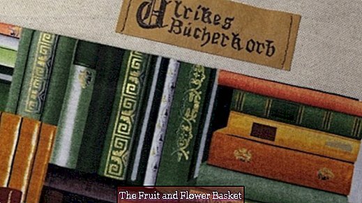
Old meets Modern: label with medieval script on SnapPap
For starters: The finished label with medieval script on SnapPap belongs to a book basket (which I will also present here after its production).
materials
- SnapPap / vegan leather
- Scissors / cutter / rotary cutter on cutting mat
- Eddings in different thicknesses: Faber-Castell, Multimark 1513 F or 1523 S - both permanent film pens Line width 0.4 or 0.6 mm edding 4600 textile pens, available individually and as assortment, line thickness approx. 1 mm - waterproof on fabrics by ironing without steam! Both pen qualities do not run when z. B. SnapPap, fabric or artificial leather then washes!
- Ballpoint pen to push through
- ruler
- Pencil, soft (HB or B - not H or about 2H ...)
- eraser
- Writing paper / copy paper
- Calculator / PC printer
Place and design labels - preliminary considerations
I wanted the label inside the book basket, there on the lining Sew. Since this is printed with books, so the eye already quite demanding, I have set up on the lining of a 5 cm wide strip of monochrome sand-colored outer fabric. Sewn on it, the label would then fully come into their own.
- The final dimensions of the label, I have adapted to the uni edge strip - the cut, however, still added around 1.5 cm, after the application of the font then in size and shape but still variable. As the label also needs to be sewn on, you should also plan for more ... millimeters of space along the edges.
- Select SnapPap in the color and the pens (Brightness Value / Line Weight).
- My suggestion: It's important to wash the SnapPap for such a typeface and wrinkle it nicely, as this will also add some antique touch to the typeface!
- In the text, the name of the owner should appear, so I am for the lettering? Ulrikes book basket? decided.
- The font size had to be chosen in such a way that there was enough space around the finished - however designed text - on the SnapPap in order to be able to sew it on the sand-colored edge without disturbing the text? would.
- Which font should it be? Since I wanted to adapt it to the lining material, it had to be a medieval font this time. I have selected one after the capital letter / initial letter? U? Although squiggly, but still not too artful, because otherwise he would have distracted from the pictorial lining.
- The arrangement of the text I wanted to take over from the writers in the monasteries of the Middle Ages: A very large capital letter directs the eye to the beginning of the actual text, which was then written down in clear smaller letters.
- In the final production I have the small letter? U? in a? converted ... sorry to our writing ancestors.)
- I then changed the alphabet in size after printing the capital letter until the capital letter? U? had the height I wanted. Here is a tip for users who like to work with the calculator: If the magnification for the display of the Word document is already preset to 100% (or you just now doing so for this purpose), you can before printing the height Measure the selected object directly on / on the screen and correct if necessary - so you avoid unnecessary cartridge and paper consumption.
- I then roughly cut out the final capital letter and tried on paper the resulting size and arrangement of the small letters.
- When I was satisfied with that, I put the (medieval) "U" on the SnapPap and with a ballpoint pen pressed all the lines ... strongly. So I could be sure that the finished letter then exactly as I had imagined.
- Using a thin permanent pen (F), I first traced all straight lines with a ruler gummed on the back (anti-slip!), Then all curved (contour) lines in pencil (you can carefully erase on SnapPap). I then overdrawn the latter with a thin pencil and filled the resulting surfaces with a much thicker edding. Well, the big letter was done!
Because I wanted to place two rows of lowercase letters next to the uppercase letter, I thought of the center and the lower edge? of the capital letter to the right with a pencil each drawn a line so that I could align the lowercase letters in the same height next to each other and then the two lines exactly parallel to each other.
I did not push through the lowercase letters (it was too fiddly), but I also wrote them by hand: For this I enlarged the alphabet - sitting in front of the computer - so much that I could look good every line and every flourish in their arrangement.At first I tried to prescribe with a pencil, but after a few attempts I managed to do better with a very thin fineliner because with such small letters (height 5 mm) I could better work out the contours and the distance from each other - courage to try just - it's all manual work, that one may like to see ...
Sew label on the lining - order ...
Because the basket area, so that also the lining had to be closed later sometime for rounding, I would attach the label - if only sewn afterwards - only under difficult conditions, because the basket cover with ironing behind I and behind is very stiff. Therefore, the label should - before closing the side seam - be sewn slightly further inward.
The lining of the basket (bookcase fabric + yellow edge strip above) should be padded on the back completely with volume fleece H640. But first I sewed on the sand-colored decorative fabric strip on the upper edge, on which a little later the label should be sewn on. But I have not ironed the seam as usual to one side, but apart, so that the last non-woven to be ironed in this area also gets good contact with the fabric surface. Also, I have renounced a decorative stitching of this seam, so as not to diminish the impression of the label. The label was then placed with two Stylefix strips at the desired location and quilted with a decorative yarn - deliberately only on the narrow sides. I did not sew from edge to edge and did not secure the seam, but let the beginning and end threads hang quite long, pulled the upper threads on the back and then knotted them here with the respective lower thread several times. So you can see from the right side of the fabric only the? Pure? Seam. As a penultimate, the volume fleece was ironed - closing the side seam was then just a matter of form ... So far, once! Looking forward to your suggestions and / or questions!
Until then here for the presentation of the finished book basket :-) Buy now  SnapPap 10 sheets A4 21x30cm 13,90 ?


